* basic astro setup, kick out all gatsby configs

* move content folder

* src/pages setup

* more file reorg

* more config updates

* more reorgs

* refactor

* refactor

* bump astro

* refactor

* svg icon build system, theme switch

* remark plugin for lead paragraph, more refactor

* make images work

* post meta

* custom Picture component

* Pagination, More component, 404 fixes

* linking fixes

* add table of contents

* post actions fixes

* tag fixes

* content changes

* content changes: move media files to their posts

* more content moving, remove media folder

* refactor remark-lead-paragraph

* link css file when defined in post frontmatter

* move content up again

* kbd post update

* allow js

* downloads solution

* add astro check

* redirect_from solution

* githubLink solution

* reorg

* exif solution as prebuild step

* exif solution on each post during build

* isolate lead paragraph extraction to articles

* restore Exif components

* deploy script update

* fix redirects

* xml & json feeds

* build fix

* fix exif readout in production

* head and seo tweaks, add feeds

* tweak image display

* archive pages with single layout

* restore tags archive

* sitemap setup

* restore thanks page functionality

* reorg

* cleanup

* parallel scripts during prebuild

* restore jest setup

* remove jest, switch to vitest as test runner

* adapt CI

* test refactor

* typescript tweaks

* avatar fixes

* typings

* restore search functionality

* theme switch with nanostores

* fixes

* test fixes

* restore changelog functionality

* umami script

* border color tweak

* related posts with fuse.js

* plawright e2e testing setup

* search tweaks

* simplify typekit loading

* photo fix

* e2e tests

* related posts fix

* fix tags archive

* tweaks

* tweaks

* linux snapshots

* fix header test

* new symlink tactic

* fix dev server in codespaces

* fix yaml

* ci fixes

* changelog loading tweaks

* e2e against dev server on ci

* changelog tweaks

* ci tweaks

* ci tweaks

* ci tweaks

* docs updates

* ci tweaks

* refactor photo creation script

* package updates

* refactor search

* ci tweak

* ci tweaks

* test tweaks, more unit tests

* more unit tests

* post creation script tweaks

* refactor new scripts, test them for real life

* more tests

* refactor

* codeclimate-action update

* uses update

* limit ci runs

* fix theme toggle, test it

* more tests

* favicon files cleanup

* icon components location change

* type checking through ci

* command fixes

* ci fix

* search tweaks

* ci tweaks

* revised favicons, write post draft about it

* drafts filtering fix

* lint fix, favicon fixes

* copy changes

* fix related search images

* content updates

* new codeblock styles, copy tweaks, fixes

* package updates

* typing fixes

* lint fix

* content updates

* restore link posts

* faster theme switching

* split up astro utils

* related posts fixes

* fix

* refactor

* fixes

* copy tweaks

* fixes

* picture tweaks

* image fixes

* feed fixes, adapt for json feed v1.1

* e2e test updates

* layout tweaks

* update snaphots

* migrate to createMarkdownProcessor

* ci cache tweaks

* activate more browsers for e2e testing

* switch to macos-13 images

* build caching tweaks

* markdown fix

* set image quality

* remove avif generation

* picture tweaks

* head fixes

* add og:image:alt

* create-icons test

* new post: Favicon Generation with Astro
5.7 KiB
| title | image | date | tags | |
|---|---|---|---|---|
| Personal Site v2 | ./mkv2.jpg | 2012-02-26 21:29:54+00:00 |
|
Today I finally launched v2 of my personal site, still following the concept of a business card web site but with a portfolio added to it. You should totally have a look.
Who needs images anyway
One goal was to use as less images as possible. Yes, it would have been easier to just use images instead of like 10 box-shadows on one element but this wouldn't have been any fun. And no matter what retina/high dpi devices come up next all interface elements will look just as sharp without any additional work.
Apart from the colored top background, the logo and the subtle background texture there're no background images in use. All the other visuals were created with a lot of CSS3 & pseudo elements. Pseudo elements were the perfect technology so the markup doesn't get cluttered with dozens of empty divs, spans etc. which would only serve a styling purpose.
All icons on the site are coming from an icon font (the wonderful IcoMoon) embedded with @font-face.
Mobile & Modern First
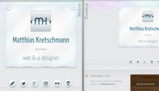
For the front-end development I've followed a mobile devices & modern browsers first approach. Therefore the site should look great on many different devices & screen sizes. As a starting point I used a combination of the 1140grid and 320 and up.
That's of course all done by media queries with breakpoints at 600px, 768px and 992px. During my testing those rather weird values turned out to work best for this simple layout. The layout only changes at 600px & 768px, the 992px is just used for some different css animations. And yes, I'm aware of the irony targeting fixed values here although everything else uses relative values.
But it's interesting to see how different the rendering of the site is in some mobile browsers. Here're some unmodified screenshots of the site in various mobile browsers on iOS 5 & Android 4:
- iOS - Mobile Safari (iPhone 4S)
- iOS - Mobile Safari (iPad)
- Android - Android Browser (Nexus S)
- Android - Chrome beta (Nexus S)
- Android - Firefox (Nexus S)
Notice the weird banding of the gradients in Firefox. And Android either ignores the min-device-pixel-ratio media query altogether or has just problems with the background-size css property.
Animations
All animations were written as CSS animations/transitions first. So in modern browsers you can disable JavaScript without losing most of the animations. And those animations are buttery smooth because they're hardware accelerated. You wouldn't notice the difference between a CSS- and jQuery-based animation on a desktop device (except if you're on a shitty netbook) but it makes a great difference on all those ARM devices. For not so cool browsers Modernizr & jQuery are kicking in to compensate for the lack of css animation support.
Except for the standard Android browser. Although the current version supports css transitions & animations it just wasn't possible to animate something smoothly here. I suspect this is caused by all the portfolio images on one page. Many images on a site always let this Browser capitulate, even on Android 4.0. So I'm being totally bad here, sniff for that particular browser and disable the animations for it. Please address your anger towards Google for that. Or just use the Chrome beta which works perfectly fine with images on a website.
Interesting side note: while Webkit-based browsers are usually the best bet to fully render all the effects on the site, they still lack css-animating pseudo elements. That's why the shine animation of the top plate on start and the drop shadow change of the social network "balls" are only smoothly animated in Firefox.
If you're interested, here're the non-minified versions of the main css file & javascript file.
The touch hover problem
A common pattern for stuff which can be revealed by hovering over something on desktop devices is to just make everything visible by default on touch devices. But I didn't wanted to clutter the portfolio items by adding buttons/text links or whatever around them.
So this led to a problem for touch users because it isn't immediately obvious how to reveal the overlays housing additional actions for each item. Approximately half of my beta testers found out about tapping a portfolio item to reveal the actions which is obviously not enough.
So I incorporated a visual hint for the other half: If a user on a touch device hasn't tapped on an item yet a subtle touch indicator starts pulsating over each item after 30 seconds.
One More Thing
If you get bored, shake your Post-PC device. On Desktops, try entering Twitter's first prototype SMS shortcode on the keyboard. Nuff' said. (could be a bit rough at the moment, be warned)
Finally many thanks to all my beta testers, you greatly helped in finding all the small quirks so the site got more usable in the end.
If you're interested in all the other components used on the site just open up the Colophon at the end of the site. And did I mention you should have a look?


