18 KiB
| title | date | tags | redirect_from | |||||
|---|---|---|---|---|---|---|---|---|
| Text-Shadow Exposed: Make cool and clever text effects with css text-shadow | 2008-04-17 01:32:13+00:00 |
|
|
 The aim of this article is to give you a quick introduction of a css property named text-shadow which was first included in CSS2 (but it's not implemented in all browsers yet). Nevertheless you can make some cool effects with it, which could only be done before by photoshopping text and rendering it as an image.
Because it's included in Safari since version 1.1(!) Mac users should be aware of various effects done by this property. In fact, most companys and persons with mac users as their main target audience use this effect on their websites.
This article describes how text-shadow works, what you can do with it and which browsers currently support it. At the end of this article I've made up some examples and provide a list of useful resources.
Here's an overview of the headlines in this article. As you can see it's rather complex and long. Be sure to get a delicious fresh cup of coffee or tea before reading on:
- What text-shadow is good for
- Which browsers support it
- Cross-browser compatibility
- How does it work and how to use it
- Examples with code & demos
- Hack: Safari Text Rendering
- More articles and resources
1. What text-shadow is good for

The main goal of this property is to give designers and css coders a tool to make text effects, which could only be done before by rendering text as images with all the side effects. Text rendered as an image isn't searchable and therefore very undelicious for search engines. Another side effect is the fact that images can be way more bigger as one small line of code in terms of file size. As you may know most css-files, which contain the whole layout of a website, are smaller than one image on most websites. So it's really clever to use a css function instead of images for reducing unnecessary traffic.

Utilizing text-shadow to simulate engraved or stenciled text is widely used on websites. Apple did it everywhere in Mac OS X not just since Leopard (just look at the titlebars). So if you design a website for Mac users you can increase the sexyness of your website, because this particular usage of text-shadow integrates very well with the overall look of Mac OS X. I will explain how to achieve this engraved-text-on-metal effect later on in this article.
2. Which browsers support it
In fact, text-shadow is not a new property since it was first defined with CSS2 in 1998 but it was just implemented by the KHTML/WebKit-folks. But it's available in Safari since version 1.1 (2003), in Konqueror since version 3.4 (I believe, not sure) and Opera 9.5. Furthermore it's also supported by Firefox 3.1/3.5 and finally Google Chrome 2 adds full support for the text-shadow property after they had stripped this from the first version of Chrome.
On the Mac platform WebKit is also used in various other programs with a browser included like Coda from Panic, CSSedit from MacRabbit or NetNewsWire from NewsGator. Also every browser which is powered by the WebKit engine is able to render the text-shadow property, like Shiira, OmniWeb or Epiphany which are either for Mac or Linux.
But with Safari 3.1, the beta release of Opera 9.5, Firefox 3.1 and Google Chrome 2 the text-shadow property is finally finding it's way to the Windows desktop after 10 years of it's birth and Opera is the first non-WebKit browser which supports text-shadow.
But wait, regarding Safari on Mac OS X there's one more (bad) thing to remember. The Mac OS X 10.5.2 update resulted in minor changes of the WebKit text-shadow rendering. It seems that with this update text-shadow is finally rendered correctly as WebKit added one extra pixel to the shadow offset on 10.4.11 and 10.5.1.
3. Any chance of cross-browser compatibility
So the major browser Internet Explorer doesn't support it yet but just don't count on Internet Explorer. I guess they are happy with coding their own non-standard version of CSS for IE9 and making shadows with those DXImageTransform.Microsoft.Shadow-stuff which in the end just looks horrible. So even IE 9 won't have it included.
But with Firefox 3.1 including text-shadow all major browsers except Internet Explorer are now supporting it. So you can start using it all around your next projects just with a lot of other techniques which in the end aren't available in Internet Explorer.
One cross-browser trick would be to use conditional tags and serve Internet Explorer users different stylesheets with either a cross-browser compatible hack or via the old school way with text rendered as images. If you don't need the blur radius value for your desired effect than there's a nice idea on Design Meme for this problem which includes producing a shadow with the css pseudo-element :before.
Now that you're aware of it's compatibility with the various browsers we can take a look at the syntax of the text-shadow property.
4. How does it work and how to use it
When defined in a css-stylesheet the property syntax should look like this:
p {
  text-shadow: 1px 1px 1px #000;
}
The first two values specify the length of the shadow offset. The first value specifies the horizontal distance and the second specifies the vertical distance of the shadow. The third value specifies the blur radius and the last value describes the color of the shadow:
- value = The X-ccordinate
- value = The Y-coordinate
- value = The blur radius
- value = The color of the shadow
Using positive numbers as the first two values ends up with placing the shadow to the right of the text horizontically (first value) and placing the shadow below the text vertically (second value).
The third value, the blur radius, is an optional value which can be specified but don't have to. It's the amount of pixels the text is stretched which causes a blur effect. If you don't use the third value it is threated as if you sepcified a blur radius of zero.
Alternatiely, for WebKit-based browsers, you can use rgba values instead of hex code colors as the fourth value. The last number stands for transparency and can be set between 0.0 and 1.0 so you can make the text-shadow more subtle:
p {
  text-shadow: 1px 1px 1px rgba(255, 255, 255, 0.5);
}
Of course the effects done by this property often depend on the colors of your text and your background, so let's take a look at what we can do with all those combinations.
5. Examples with code & demos
I've made up some examples to show you the possibilities of this css property. Every example code follows a text example which is rendered by your browser. Below that you'll find a screenshot of the described effect rendered in Safari 3.1 on Mac OS X 10.5.2 so the non-WebKit and non-Opera Internet Explorer users can see the effect.
5.1 Simple drop shadow
With the following lines of css code you get black text on white background with a smooth black drop shadow.The shadow is placed 2 pixels right and 2 pixels below the text and has a blur radius of 3:
color: #000;
background: #fff;
text-shadow: 2px 2px 3px #000;
I'm a text with a smooth shadow

Or you can make it not so smooth but also good looking by ignoring the blur radius and setting a lighter color for the shadow:
color: #000;
background: #fff;
text-shadow: 2px 2px #000;
I'm a text with no smooth shadow

Using some negative values you can make the shadow look like it's lightsource is placed below the text:
color: #000;
background: #fff;
text-shadow: 2px -2px 3px #000;
I'm a text with a smooth shadow

Of course you can make it more funky and horrible to read:
color: #33cc33;
background: #fff;
text-shadow: 2px 2px 2px #ff3300;
I'm funky colored text

5.2 Apple style (engraved text on metal)
With those lines you get this engraved-text-on-metal effect often used by Apple. You should use a grey background and a very dark text color for this. It's nothing more than a white or light grey shadow which is placed 1px below the text. You can use a blur of 1 to make it look more round. I've used bold text to make the effect more visible:
color: #000;
background: #666;
text-shadow: 0px 1px 1px #fff;
I'm engraved text

This even works the other way around on a black background with grey text by adjusting only the color values:
color: #666;
background: #000;
text-shadow: 0px 1px 0px #ccc;
I'm engraved text on black

Or you can make this one which looks like the text stands out from the background:
color: #fff;
background: #666;
text-shadow: 0px 1px 1px #000;
I'm on top of the background

5.3 Make your text glow
By utilizing the blur radius we can achieve some interesting effects. Here's some subtle glowing white text on a black background:
color: #fff;
background: #000;
text-shadow: 1px 1px 6px #fff;
I'm subtle glowing text

You can also make the whole text blurry by using the same color for text and shadow with no offset:
color: #fff;
background: #666;
text-shadow: 0px 0px 3px #fff;
I'm also glowing but more blurry

We can make it quite mysterious by using the same color for text and background and make the text just visible through text-shadow. Remember that the same color for text and background can be bad for usability...:
color: #000;
background: #000;
text-shadow: 1px 1px 4px #fff;
I'm pretty mysterious looking text

Or the other way around to make it look light and... milky:
color: #fff;
background: #fff;
text-shadow: 1px 1px 4px#000;
I'm pretty milky looking text

5.4 Duplicate your text
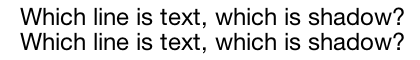
With text-shadow you can make pixel-perfect dublicates of any text. Just add some pixels to your font-size and use it as a value for the vertical description of the shadow offset:
color: #000;
background: #fff;
text-shadow: 0px 20px #000;
Which line is text, which is shadow?
5.5 Multiple shadows
Sadly Safari 3 isn't able to render more than one shadow on one element. It just renders the first property description and will ignore all others. But using multiple shadows looks awesome. So currently the following will only work in Opera 9.5 beta or Konqueror. Just have a look at the screenshot below the example if you're not using these browsers. Due to the lack of support for this in Safari the screenshot below the example is rendered in Opera 9.5 beta on Mac OS X 10.5.2. For no reason Opera 9.5 beta doesn't render the background color:
color: #000;
background: #000;
text-shadow: 0 0 4px #ccc, 0 -5px 4px #ff3, 2px -10px 6px #fd3, -2px -15px 11px
    #f80, 2px -18px 18px #f20;
Isn't this awesome?

6. Hack: Avoid jagged light-on-dark text rendering in Safari

More than a hack than an effect but it addresses the poor light-on-dark text rendering in Safari. This is caused by the sub-pixel rendering of OS X's Quartz 2D layer as a part of the Core Graphics framework. Also Safari 3.1 on Windows uses sub pixel rendering instead of plain anti-aliasing.
In most situations this improves the legibility and smoothness of all 2D-text rendered throughout the Mac OS X interface which makes everything look so gorgeous. But it has some rough problems with light text on dark backgrounds in Safari This problem doesn't exist when using anti-aliasing.
And since 24ways' and Cameron's discovery we know that Safari renders all text-shadow-styled text with plain anti-aliasing instead of sub-pixels. So we can add a text-shadow with an offset of 0px to the desired text style:
text-shadow: 0 0 0 #000;
This causes Safari 3 to use anti-aliasing and make your text on dark backgrounds more legible with it.
But this won't work with the new Safari 4 (public beta) as John pointed out in the comments. To just cite him:
Apparently if your shadow has no blur, then the text will be sub-pixel rendered. But more than 1px blurred uses the anti-alias rendering like "usual."
But fear not. Rogie King already came up with a solution for this which you can read here: Safari's text-shadow anti-aliasing CSS hack Revision
7. More articles and resources
-
Description of the text-shadow property in: CSS3 W3C Candidate Recommendation from 14 May 2003 text-shadow in-depth
-
Cross-browser text-shadow by Kilian Valkhof Nice article about trying to make text-shadow cross-browser compatible
-
CSS Drop Shadows on Design Meme An easy css-hack for cross-browser compatibilty (but without a blur radius)
-
text-shadow hack for firefox on klog Another hack just for Gecko-based browsers by utilizing javascript
-
Firefox plugin "A Text Shadow" A xpi-plugin providing support for text-shadow in Firefox written by Shimoda Hiroshi
-
Animating css text-shadow with javascript The author animates multiple text-shadows with javascript, really incredible. Also various nice examples on this page.
-
Text-Shadow in Safari 1.1 Propably the oldest text-shadow demo originally made for Safari 1.1
-
10.5.2 brings WebKit text-shadow rendering changes Blog entry on islayer.com about different text-shadow rendering across different Mac OS X versions
-
CSS3 preview on css3.info "Everything you need to know about CSS3" - get excited before CSS3 becomes final