* basic astro setup, kick out all gatsby configs

* move content folder

* src/pages setup

* more file reorg

* more config updates

* more reorgs

* refactor

* refactor

* bump astro

* refactor

* svg icon build system, theme switch

* remark plugin for lead paragraph, more refactor

* make images work

* post meta

* custom Picture component

* Pagination, More component, 404 fixes

* linking fixes

* add table of contents

* post actions fixes

* tag fixes

* content changes

* content changes: move media files to their posts

* more content moving, remove media folder

* refactor remark-lead-paragraph

* link css file when defined in post frontmatter

* move content up again

* kbd post update

* allow js

* downloads solution

* add astro check

* redirect_from solution

* githubLink solution

* reorg

* exif solution as prebuild step

* exif solution on each post during build

* isolate lead paragraph extraction to articles

* restore Exif components

* deploy script update

* fix redirects

* xml & json feeds

* build fix

* fix exif readout in production

* head and seo tweaks, add feeds

* tweak image display

* archive pages with single layout

* restore tags archive

* sitemap setup

* restore thanks page functionality

* reorg

* cleanup

* parallel scripts during prebuild

* restore jest setup

* remove jest, switch to vitest as test runner

* adapt CI

* test refactor

* typescript tweaks

* avatar fixes

* typings

* restore search functionality

* theme switch with nanostores

* fixes

* test fixes

* restore changelog functionality

* umami script

* border color tweak

* related posts with fuse.js

* plawright e2e testing setup

* search tweaks

* simplify typekit loading

* photo fix

* e2e tests

* related posts fix

* fix tags archive

* tweaks

* tweaks

* linux snapshots

* fix header test

* new symlink tactic

* fix dev server in codespaces

* fix yaml

* ci fixes

* changelog loading tweaks

* e2e against dev server on ci

* changelog tweaks

* ci tweaks

* ci tweaks

* ci tweaks

* docs updates

* ci tweaks

* refactor photo creation script

* package updates

* refactor search

* ci tweak

* ci tweaks

* test tweaks, more unit tests

* more unit tests

* post creation script tweaks

* refactor new scripts, test them for real life

* more tests

* refactor

* codeclimate-action update

* uses update

* limit ci runs

* fix theme toggle, test it

* more tests

* favicon files cleanup

* icon components location change

* type checking through ci

* command fixes

* ci fix

* search tweaks

* ci tweaks

* revised favicons, write post draft about it

* drafts filtering fix

* lint fix, favicon fixes

* copy changes

* fix related search images

* content updates

* new codeblock styles, copy tweaks, fixes

* package updates

* typing fixes

* lint fix

* content updates

* restore link posts

* faster theme switching

* split up astro utils

* related posts fixes

* fix

* refactor

* fixes

* copy tweaks

* fixes

* picture tweaks

* image fixes

* feed fixes, adapt for json feed v1.1

* e2e test updates

* layout tweaks

* update snaphots

* migrate to createMarkdownProcessor

* ci cache tweaks

* activate more browsers for e2e testing

* switch to macos-13 images

* build caching tweaks

* markdown fix

* set image quality

* remove avif generation

* picture tweaks

* head fixes

* add og:image:alt

* create-icons test

* new post: Favicon Generation with Astro
4.2 KiB
| title | image | date | tags | ||
|---|---|---|---|---|---|
| The Android Tab Bar Conundrum. Again. | ./tabs_overview.png | 2012-04-04 14:24:30+00:00 |
|
With Instagram for Android there's once again an app getting ported to Android from iOS which doesn't follow the platform specific guidelines with a lot of elements. But this time it's a bit complicated, let me explain.
Most obviously in the form of the app's main navigation tabs which Instagram for Android puts at the bottom as opposed to Google's suggested placement of tabs at the top as part of the action bar. Now smart Android designers chime in and call foul for this Android Design Guideline violation as others and I have done in the past with other apps.
Problem No. 1: Navigation Controls
The suggested top placement in the Android Design Guidelines was an answer to a typical Android specific problem: the very bottom of Android apps is reserved for on-screen navigation buttons, originally capacitative off-screen buttons. And those can get triggered accidentally when reaching tabs in a tab bar at the bottom of the screen. Let's dub this problem no. 1.
Now I'm usually all for breaking the rules because that's the only way innovation can happen. But this breaking needs to be thoroughly thought through and involves a deep understanding of the rules being broken. While a lot of iOS ports just use the bottom tab bar out of habit and non-thinking, Tim and the Instagram guys don't fall in this camp.
Problem No. 2: Longer Screens

The usage of a bottom tab bar in Instagram for Android is an answer to a relatively new problem which isn't incorporated in the Android Design Guidelines: bigger screens, or more precisely longer screens, make it very hard to reach tabs at the top of the screen when holding the device with one hand. When looking at all those new devices it seems clear screen sizes above 4" are now the norm for Android. This is problem no. 2.
In my view it all comes down to balancing those 2 problems against each other and, as said on Twitter, Tim decided to value problem 2 over problem 1:
on the Galaxy Note it's impossible to get to the tabs with one hand if they're on top.
— Tim Van Damme (@maxvoltar) April 3, 2012
And I'm afraid he's right: it's just more important for users to reach the tabs with one hand than preventing them from accidently triggering the OS buttons. When an app has a tab bar it's usually the main element to navigate inside an app so it's crucial to reach those elements very fast. Also problem 1 is less of a problem on devices like the Galaxy Nexus with its on-screen buttons, they just don't get triggered by accident so easily as those off-screen capacitive buttons.
A way out
So we really need to rethink this specific guideline but this doesn't have to be just the decision between top or bottom placement of tabs.
There's another way out to solve both problems: Combining scrollable & fixed tabs. This is already used by Google in ICS's built-in Phone and People app (thanks Jake!). And Instagram for Android could have used the same fixed tabs on the top of the screen but combine them with a swipe left/right gesture to navigate between those tabs. (Per guideline a swipe view needs to get a corresponding scrollable, text-only tab bar)
Here's a quick mockup:
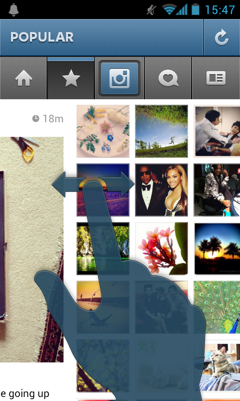
Users wouldn't have to reach for the tabs to change views and nobody would accidently trigger the OS buttons at the bottom. The active states of the current and new tab item could fade corresponding to the swiping, same goes for the title of the current view in the very top bar. Another way could have been to split action & navigation tabs like Guenther Beyer did in his mockup.